Pada snippet ini kita akan menampilkan efek untuk menampilkan caption yang lebih komplex. Silakan gunakan image Anda sendiri atau menggunakan image berikut untuk latihan.
<div class="container">
<img src="https://skillplus.web.id/wp-content/uploads/2021/10/tori-on-water.jpg">
<div class="caption">
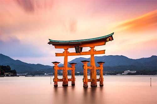
<h2>Itsukushima Shrine – Hiroshima</h2>
<p>Known by its 16-meter brilliant vermillion otorii gate that seemingly floats amidst the Seto Inland Sea at high tide, this Shinto shrine sits along the crescent beach of Itsukushima Island, just 10-km southwest of Hiroshima City.</p>
<a href="#">read more</a>
</div>
</div>
* {
   margin: 0;
   padding: 0;
}

body {
   height: 100vh;
   display: flex;
   justify-content: center;
   align-items: center;
   font-family: 'Lato', sans-serif;
   background-color: #272727;
}

.container {
  width: 450px;
  height: 300px;
  position: relative;
  overflow: hidden;
}

img {
  width: 100%;
}

.container:before {
  content: "";
  position: absolute;
  top: 0;
  left: 0;
  width: 120%;
  height: 205%;
  background-color: #2d3436;
  opacity: 0.8;
  transition: all 0.25s;
  overflow: hidden;
  transform: translate(550px, 300px) rotate(45deg);
}

.container:hover:before {
  transform: translate(-50px, -150px) rotate(45deg);
}

.caption {
  position: absolute;
  top: 0;
  left: 0;
  width: 100%;
  height: 100%;
  display: flex;
  flex-direction: column;
  justify-content: space-around;
  color: white;
  text-transform: uppercase;
}

h2 {
  text-align: center;
  font-size: 17px;
  padding: 20px;
  margin-top: 20px;
  background-color: rgba(0, 0, 0, 0.8);
  transform: translate(200px, -200px);
  transition: all 0.25s;
}

.container:hover h2 {
  transform: translate(0, 0);
  transition-delay: 0.3s;
}

p {
  font-size: 16px;
  width: 80%;
  align-self: center;
  text-align: center;
  transition: all 0.25s;
  transform: translate(-200px, 200px);
}

.container:hover p {
  transform: translate(0, 0);
  transition-delay: 0.4s;
}

a {
  text-decoration: none;
  background-color: black;
  color: white;
  width: 100px;
  padding: 15px;
  margin-bottom: 20px;
  align-self: center;
  transition: all 0.25s;
  transform: translateY(100px);
}

.container:hover a {
  transform: translateY(0);
  transition-delay: 0.5s;
}